
Brand Toolkit
Last Updated: October 3, 2025
Introduction
Meet the MMA. We lean into the future and lead the marketing industry.
The MMA takes on real marketing challenges with bold innovation and rigorous research. We are a peer-driven CMO community, relentlessly pursuing new skills, tools, and business growth. We uplift and empower each member and, as an alliance, lead the industry forward into the future.
The MMA invites those with grit and vision to join us in pushing the limits of marketing for themselves, their businesses, and the future.
These guidelines give us the tools to show up in a way that is unified, bold, and motivating.
Logo + Wordmark
MMA Progress
The MMA Primary Mark's bold black letterforms, sliced by vivid gold diagonals, radiates focus, motion, and intent. The sharp, forward-leaning cuts suggest an unflinching drive to take on challenges and push past limits, while the gold channels ambition and excellence. It's a symbol of momentum and invention in equal measure—bold enough to experiment, relentless enough to lead.
In a word, Progress.
Wordmark
The MMA wordmark introduces the new name: inspiring, inviting, galvanizing. As an alliance, not an association, MMA attracts the boldest thinkers and moves the industry forward. To emphasize and socialize the name, include the Wordmark in a lockup with the Progress Mark.
NOTE: When writing the full name in copy, always use the plus (+) symbol, NOT an ampersand (&) or the word "and", e.g., Marketing + Media Alliance.
Lock-up Structure
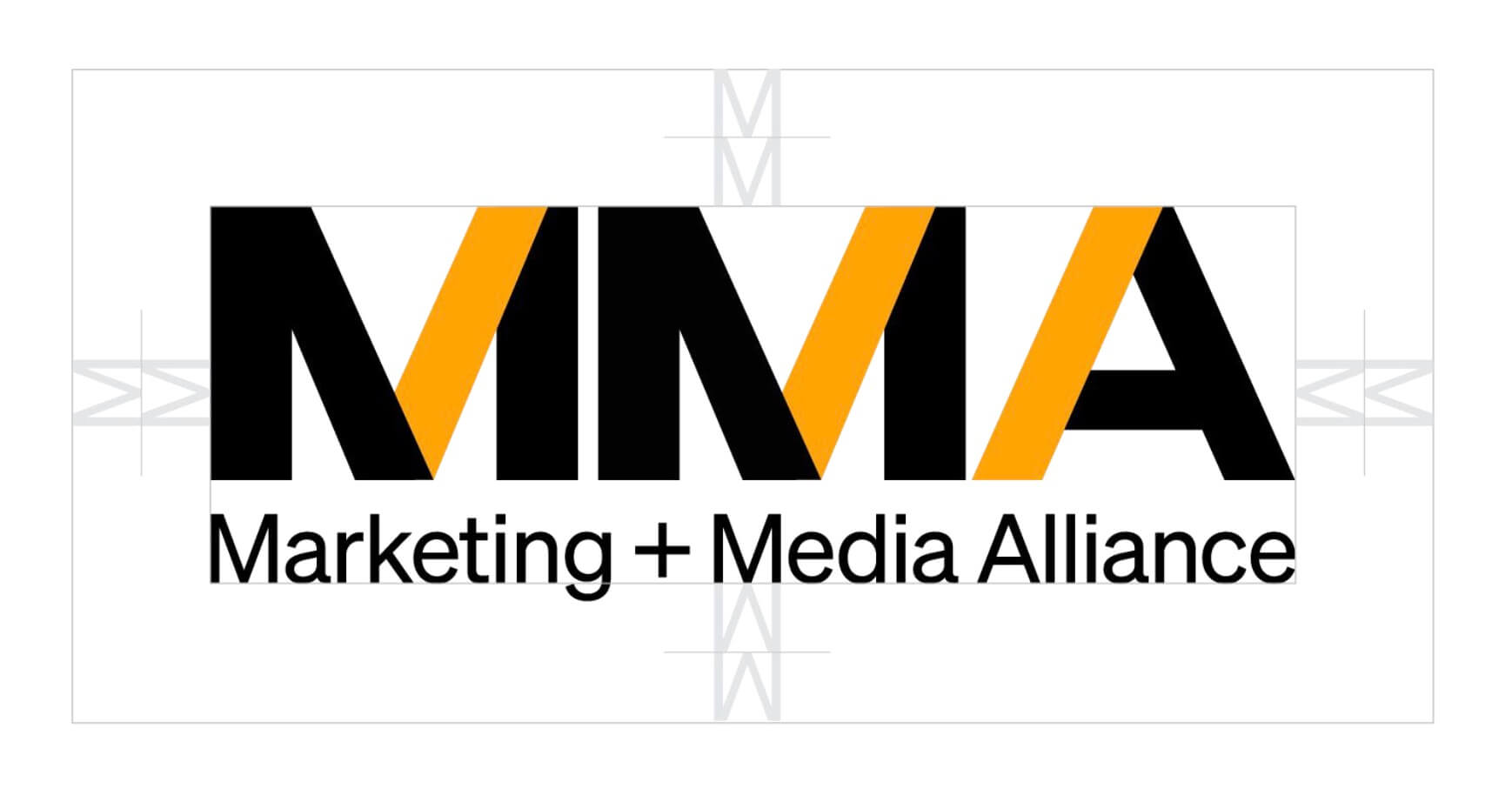
The Wordmark forms both the literal and figurative foundation that the MMA brand is built on. The relationship between it and the Progress Mark is fixed and should NEVER be altered. The space between the bottom edge of the Progress mark and the top edge of the Wordmark is ALWAYS .5 X the height of the Wordmark.
Logo Usage
Primary Marks
Primary (White Background)
Use the 2C MMA logo against a white background. The standard configuration with black letterforms and gold diagonal accents.
Inverse (Black Background)
Use the 2C R_Neg MMA logo against a black background. Gold letterforms with white diagonal accents for maximum impact on dark surfaces.
On Gold Background
Use the 2C Neg MMA logo against a gold background. Black letterforms with white diagonal accents create a bold, premium appearance.
Grayscale (White Background)
Use the black/grey MMA logo against a white background when color reproduction is limited.
On Photo
The grey/white MMA logo can be applied to photographic backgrounds. Ensure sufficient contrast for readability.
Safe Zone
Utilize the height of the letterforms as a gauge for guaranteeing the appropriate amount of clearance surrounding the MMA wordmark. Employing 2X the height of the "M" in "Marketing" will provide the correct amount of spacing required.
What Not to Do
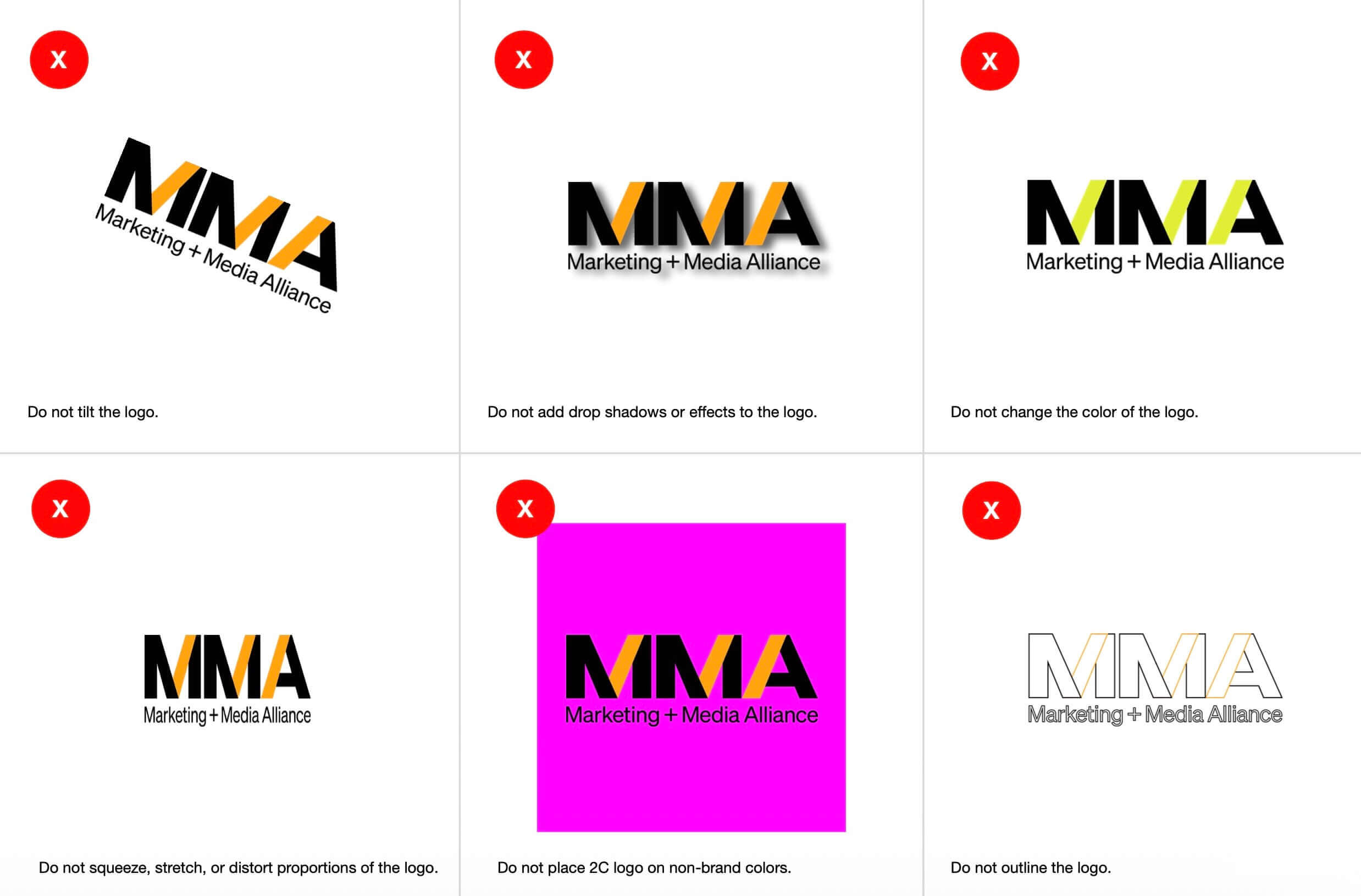
To maintain brand integrity and consistency, avoid these common mistakes when using the MMA logo:
- Do not tilt the logo
- Do not add drop shadows or effects to the logo
- Do not change the color of the logo
- Do not squeeze, stretch, or distort proportions of the logo
- Do not place 2C logo on non-brand colors
- Do not outline the logo
The Diagonal
When to use it
The Diagonal is an integral part of the Primary Mark and can be isolated and applied within the brand palette as an accompanying design element. The Diagonal creates consistency while offering flexibility and visual variety. Portable, forward-leaning, dynamic, and adaptable, it brings "Progress" to every platform and usage.
NOTE: The White Diagonal does NOT use the grey outline.
Typography
Söhne Halbfett (Headings)
Söhne Halbfett is a modern grotesk typeface that offers a strong balance of functionality and character. Its precise forms and subtle humanist details give the MMA brand a contemporary edge while remaining approachable.
- Weight: Normal (600)
- Leading: +10% for clear legibility
- Tracking: 0
Söhne Licht (Body Copy)
Söhne Licht brings clarity and poise to the brand's voice. Its lightweight and open proportions make it ideal for text, offering refinement and ease across platforms.
- Weight: Regular (300)
- Leading: +20% for clear legibility
- Tracking: +10
Tiempos Text (Alternative Body)
When paired with Söhne Halbfett, Tiempos Text offers exceptional readability and refinement. Tiempos is added to the font set for use when there is a need for a clear distinction in the "color" of long blocks of text. It can also be used to highlight "pull quotes".
Colors
Primary Colors
MMA Gold and Black are the primary brand colors. The authority of gold - the highest standard - is given a contemporary tone blending excellence with urgency and power. Black reinforces the palette by providing a solid foundation, adding professional directness and strength to the MMA brand.
Secondary Colors
The secondary colors introduce a sense of vibrancy and energetic touch to the MMA brand. These tones are often linked to media and technology, making them an ideal complement to the future-facing MMA mission.
Tone + Voice
Across every touchpoint
Our tone may shift in different contexts, but our voice should always sound like it's coming from the same brand. By following these guidelines, we can ensure that all of our communications build trust, confidence, and attract members to join us.
MMA is the Hero
MMA isn't going it alone, it assembles the team to triumph through bravery, perseverance, and mastery. Like Nike, MMA inspires greatness through grit.
Our voice is...
- Energetic
- Sharp
- Smart
- Clear
- Confident
- Generous
- An alliance
Key Message
Lean into the future. Lead the marketing industry.
Global CMOs taking on real challenges with bold innovation and rigorous research. Join the alliance in pushing the limits of marketing for yourself, your business, and the future.
Application Examples
The MMA brand system works across all touchpoints—from digital to print, from social media to stationery. These examples demonstrate how the logo, typography, colors, and diagonal element come together to create a unified, bold presence.
Available Resources